First discovered on Reddit and since confirmed by the Stadia team, the Stadia homepage is getting a significant redesign for logged in users.
One of our staff members has access to the new look on a test account. Below is what you can look forward to.
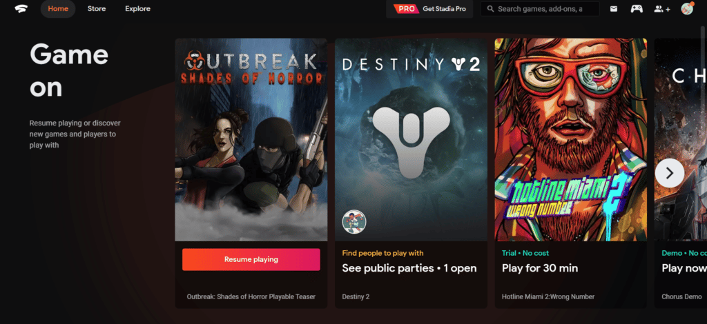
First, the top of the page lets you quickly resume playing your latest game and then highlights public parties and Free Trials that you can launch.
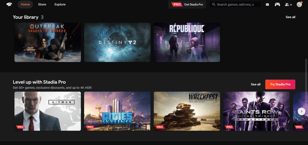
You next see rows covering your library of games and a summary of stadia pro games for those who haven’t yet subscribed.
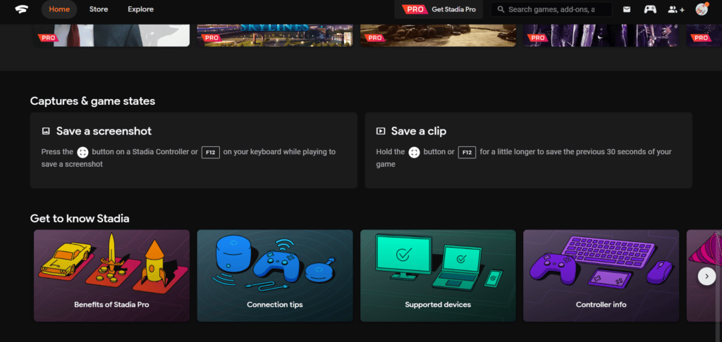
After that, you’ll see your captures and then a nifty little section called “Get to know Stadia” which has a series of cute illustrated links to various tips and tricks pages that can help you improve your overall Stadia experience.
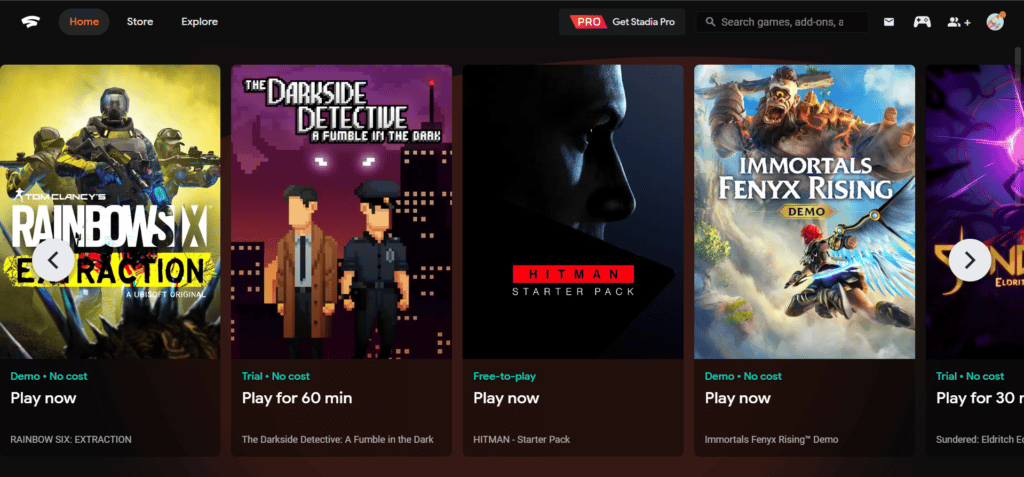
It’s also interesting to note that in the top row, the new homepage highlights both free-to-play demos as well as time-based trials and completely free to play games.
This new UI should be rolling out to everyone over the next few days. Let us know what you think of the changes in the comments. Are you happy to see the Stadia team continuing to refine the user experience?






This is so awesome! All the haters can shove it. Stadia is here to stay
Welcome to the “will never trust a Google service again” club. From those of us who learned this the hard way a long while back, it’s a shame that it had to happen like this.
But hey, look on the bright side: If you do learn from this and understand how myopic Google’s strategy is, then there’s a very good chance that you’re more capable of learning from your mistakes than anyone in charge of things over at Google is.